


Sophie Warren Smith
Sophie has been an interior stylist and journalist for over 23 years and has worked for many of the main interior magazines during that time, both in-house and as a freelancer. A regular contributing editor at Homes & Gardens and Ideal Home online, Sophie writes features that include colour, pattern and texture and how to make them work in your home effortlessly. In 2019, she trained to be a florist and set up The Prettiest Posy, offering oh-so-pretty flowers for the modern bride.
You may have noticed that every year colour experts, Pantone, announce their ‘Colour of the Year’. It’s their trend forecast for the following 12 months to guide and inspire us all, and the main paint houses like Crown, Dulux and Benjamin Moore also release theirs. It’s become a big part of the interior calendar and is an exciting time, as they showcase what’s ahead and there’s always more than one to choose from.
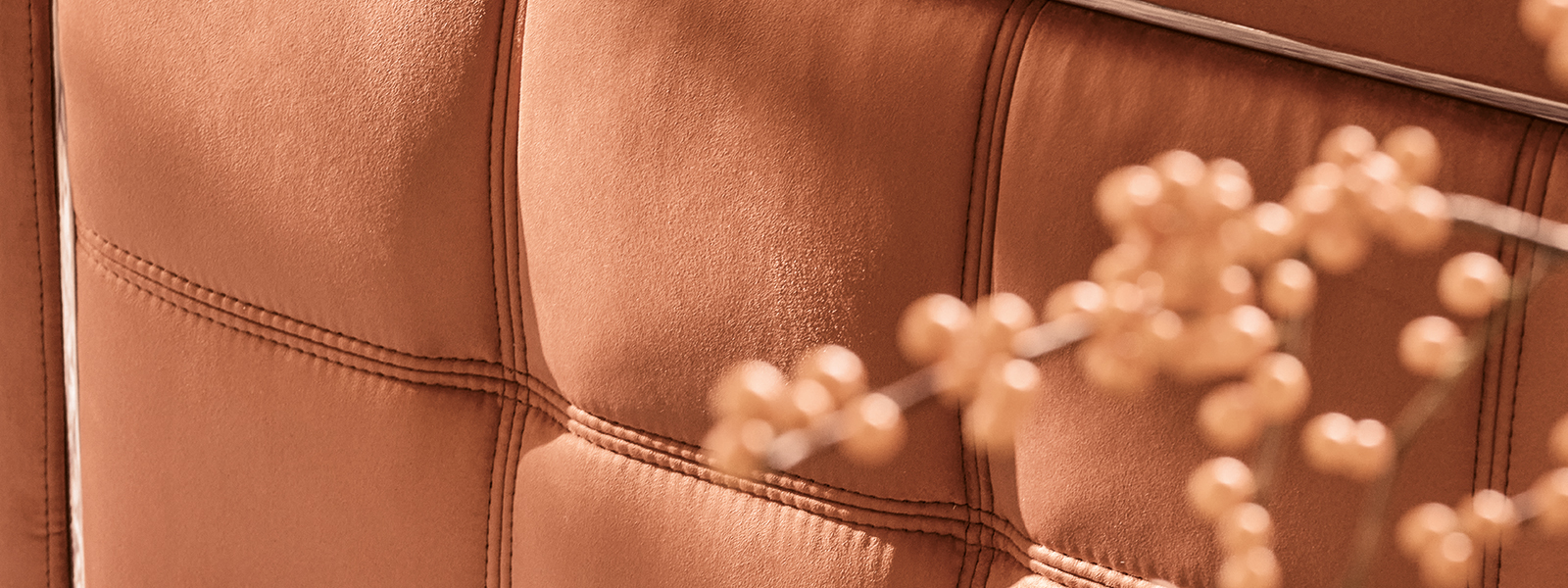
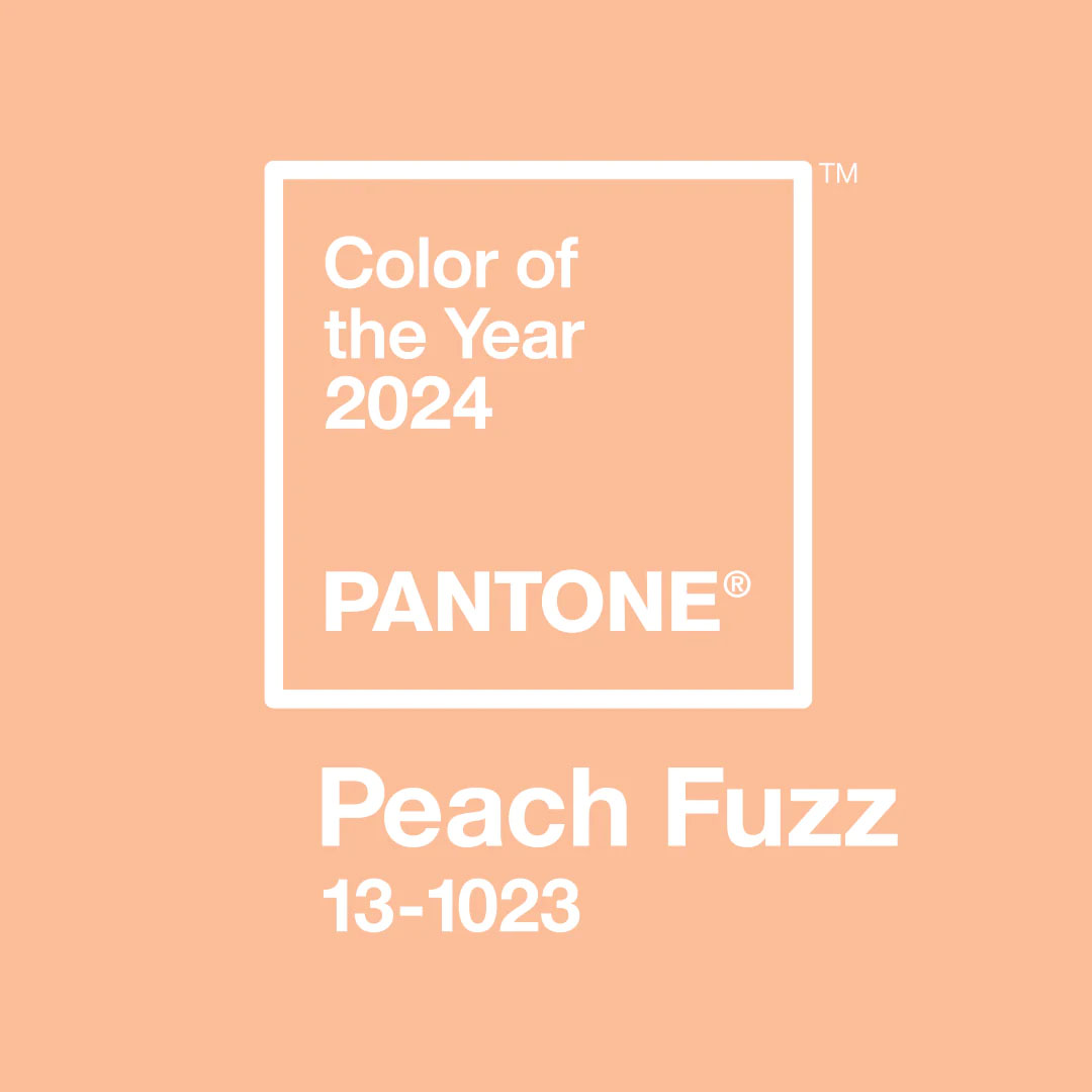
Last week Pantone announced their eagerly anticipated main colour of the year as Peach Fuzz, chosen by a team of leading global design experts. It’s a beautiful velvety peach that’s warm, calming and nourishing – and there are plenty of opportunities for use in our homes next year. It’s a big change from last year’s Viva Magenta, which was vibrant and strong, but admittedly harder to use in our homes. What’s great about this year’s colour is how it will go with everything, from crisp white to jet black, neon pink to navy, but also earthy shades like terracotta and linen. Other colours to consider in combination are pale pinks, apple green and sky blue – this is what makes Peach Fuzz such a fabulous choice, as it’s so versatile.
2024’s Colour of the Year is the 25th in a row for Pantone. Everything from fashion, marketing, societal shifts and what’s happening in social media gets taken into consideration.
‘In seeking a hue that echoes our innate yearning for closeness and connection, we chose a colour radiant with warmth and modern elegance. A shade that resonates with compassion, offers a tactile embrace, and effortlessly bridges the youthful with the timeless,’ says Leatrice Eiseman, executive director, Pantone Color Institute™
How to use Peach Fuzz
Sitting between pink and orange, Peach Fuzz has been chosen by Pantone for its heartfelt glow. Its warming tones will promote a sanctuary vibe that comforts and heals whatever space you use it in. Almost neutral, there are several different ways to use it within your interiors.
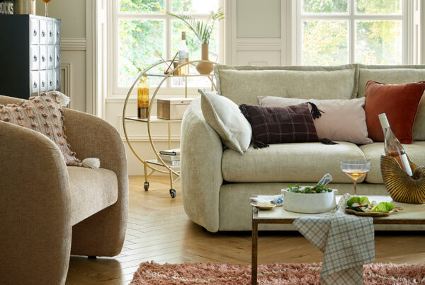
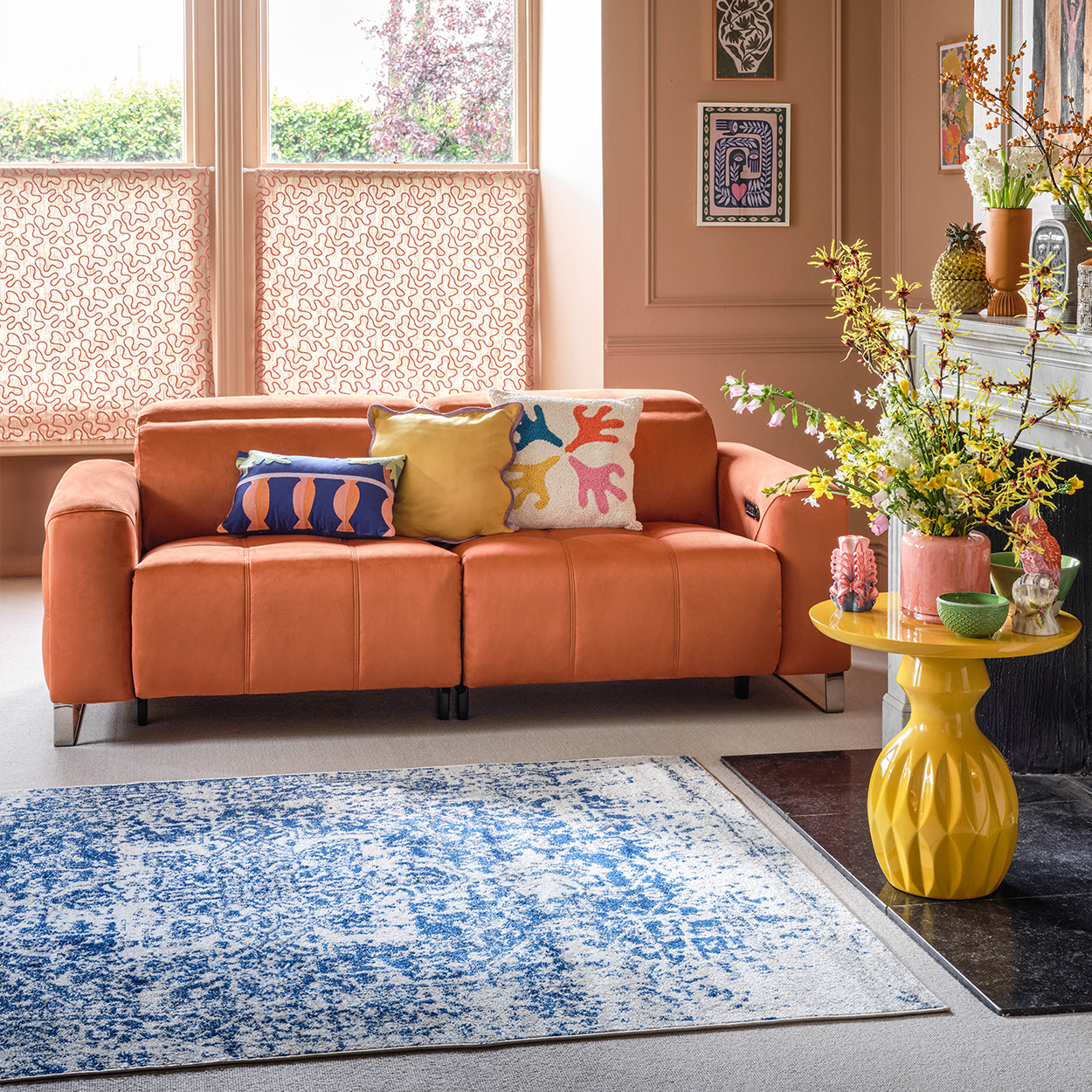
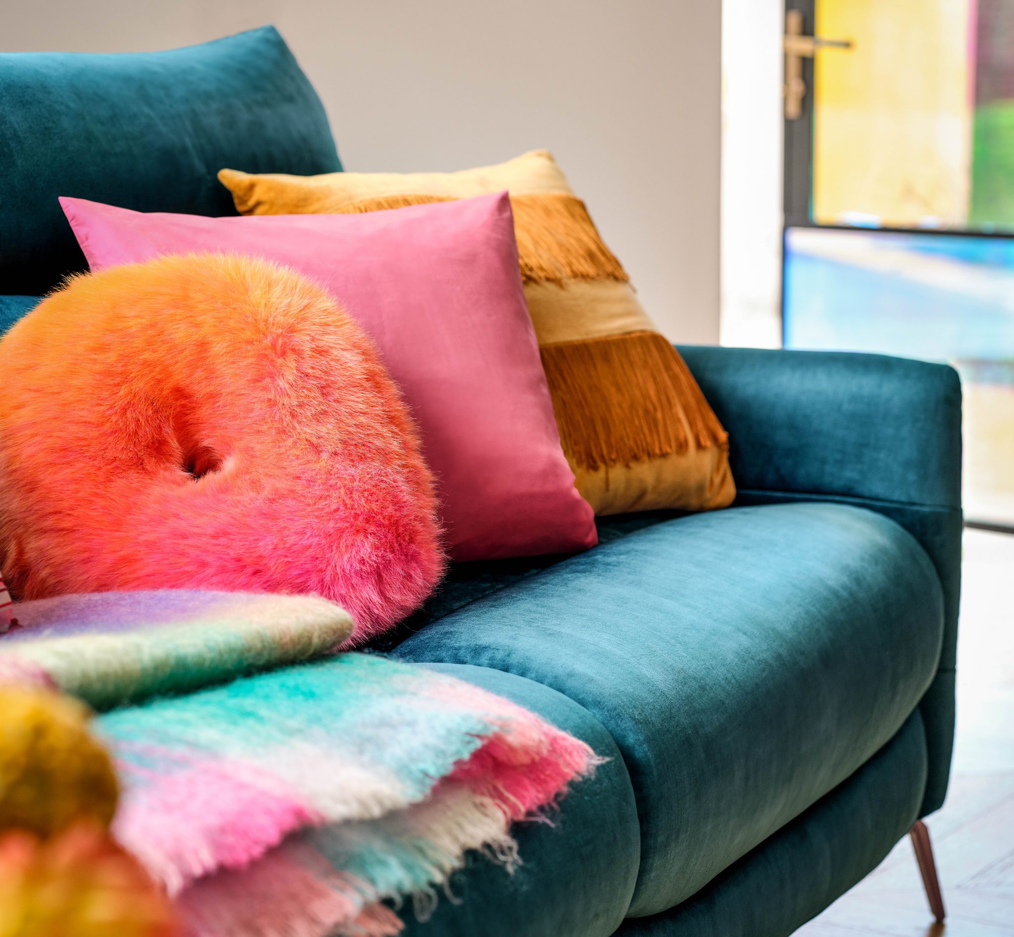
Sofology has used a very similar shade to Peach Fuzz in this living room – it works as a gentle, neutral shade that will warm up a North-facing space perfectly. The Marvella 2.5 seater power recliner in Lifestyle Plush Fabric Burnt Orange is the perfect punchy colour to stand out, yet it sits in the same colour family as Peach Fuzz. Team it with a bright blue – the perfect colour as it’s complementary to peach/orange, and add in pops of yellow and red too.
Or, if you simply want a hint of Peach Fuzz you can choose cushions, throws and small accessories like vases and candles in this charming hue instead.
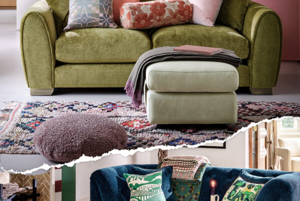
Sofology’s exciting new colour-led Spring/Summer collection features many of the predicted shades, and you’ll find some bright supporting colours if Peach Fuzz is not for you. With an emphasis on teal (Pantone Horizon Blue) and lime (Pantone Charlock) these colours have a playful uplifting feel and will be big news in the fashion world too.
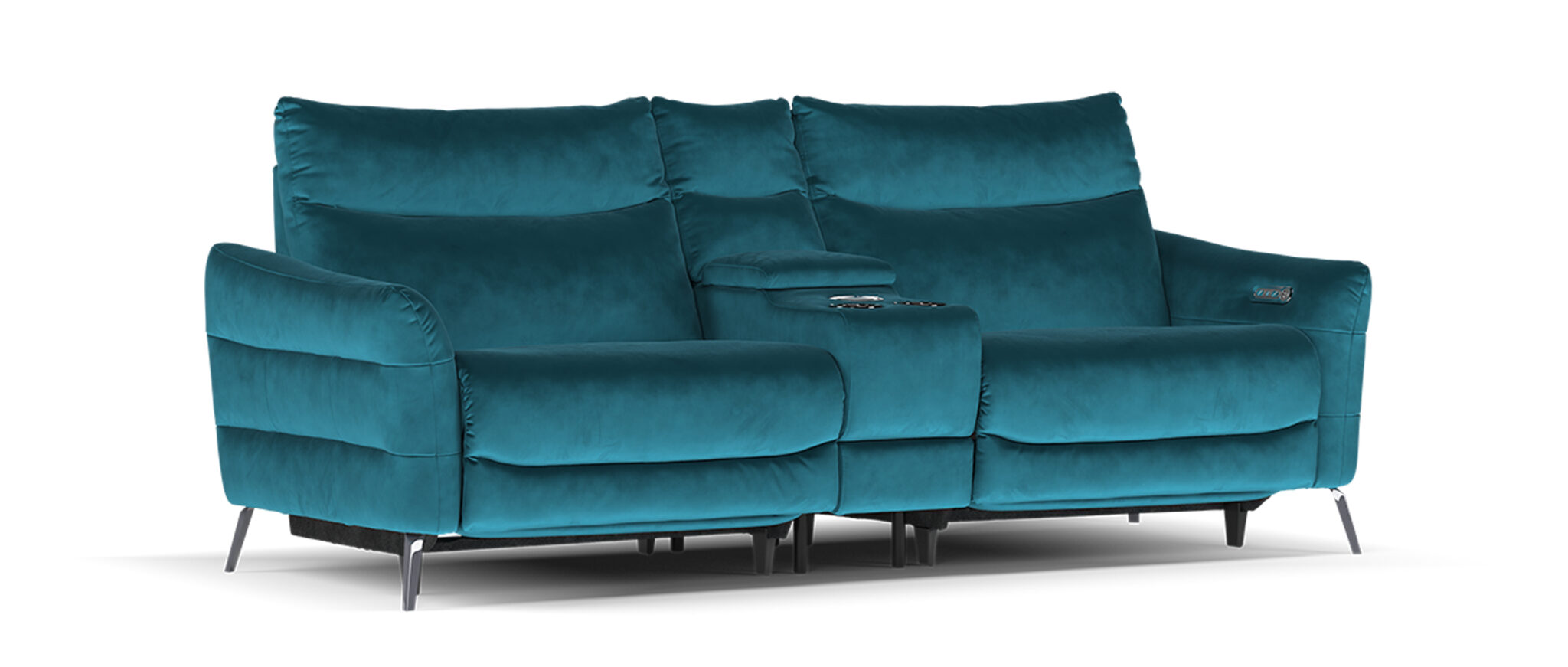
How to use teal
Ahead of the game as always, Sofology’s Renato 2.5 seater in Heritage Velvet Teal is the perfect match. It would be a fabulous accent colour in a living room painted in Peach Fuzz, and it looks great with hot pink and bright orange as well. If the idea of using this much of it is slightly daunting, opt for teal accessories instead.
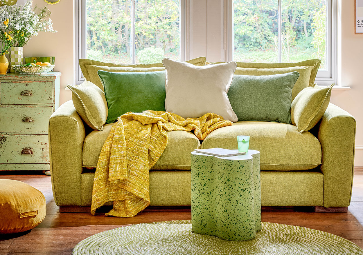
How to use lime
Not often a colour we think of using in our homes, lime can be a tricky shade to implement. However, when it’s teamed with other zesty shades of soft yellow and pastel green, it looks fresh and inviting. Sofology’s Gaia 3 seater in Gaia Buckingham Honey Mix is a super comfy sofa in this revitalising shade. A good neutral to use with this colour is oatmeal – think slubby linen cushions with matching blinds.
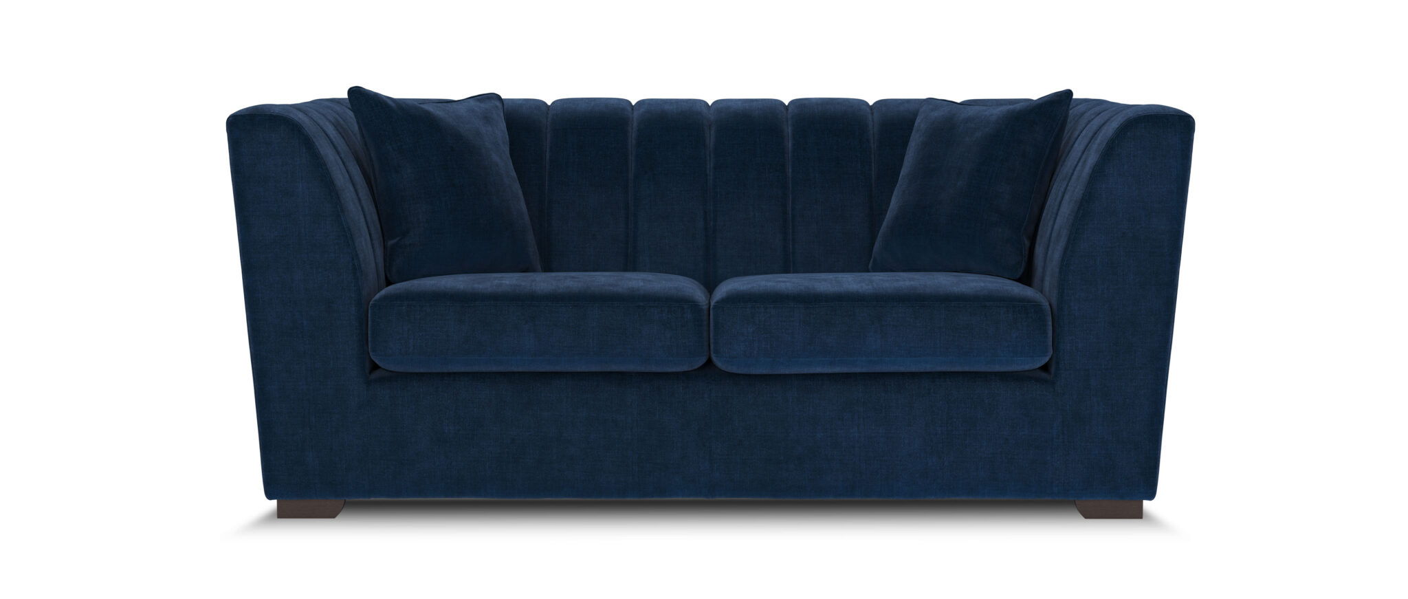
If these three shades aren’t for you, then consider a warming denim blue with hints of violet from leading paint company Blue Nova 825. Sofology’s Downtown 2-seater in Aston Navy All Over is a good match, and it’s a great colour to use bright cushions and throws with. Interestingly, this is a colour that will work well with Peach Fuzz.
The colour palette for 2024 is full of happiness with its pretty tones of peach, teal and lime. You can mix and match these shades that have been carefully chosen by the experts at Pantone. Peach Fuzz is optimistic and gentle, and is a very usable shade that you’ll see everywhere in the coming months. So, get ahead of the game now and start sourcing your fabulous peachy accessories and furniture.